

Something shifted this year. After a decade of cool grays, stark whites, and the general reign of greige, the design world is leaning hard into warmth. Pantone named Cloud Dancer—a soft, billowy white—its 2026 Color of the Year, signaling what the Pantone Color Institute called “a collective desire for serenity.” It was the first time Pantone chose a shade of white, and the intent was clear: quiet down, start fresh. HGTV Home by Sherwin-Williams followed with Universal Khaki, a sandy neutral that feels like afternoon light on old plaster. The message from both is the same. We are done with cold. We want rooms that feel sun-touched, gently worn, intentionally warm.
The designer consensus
This is not a niche conversation. House Beautiful named warm neutrals “the new neutrals of 2026,” spotlighting putty, mushroom, and sand as the palette replacing greige in American homes. Elle Decor’s annual color forecast quoted designer Jen Baxter describing a movement toward “earthy, organic mid-tones” with a “timeworn” quality. Real Simple profiled the warm minimalism trend—spaces that are pared back but never stark, where texture and tone do the work that pattern used to. Even the paint majors have noticed. Benjamin Moore’s Pale Oak. Sherwin-Williams’ Cavern Clay. Farrow & Ball’s Broccoli Brown. The industry is betting on earth tones with staying power.

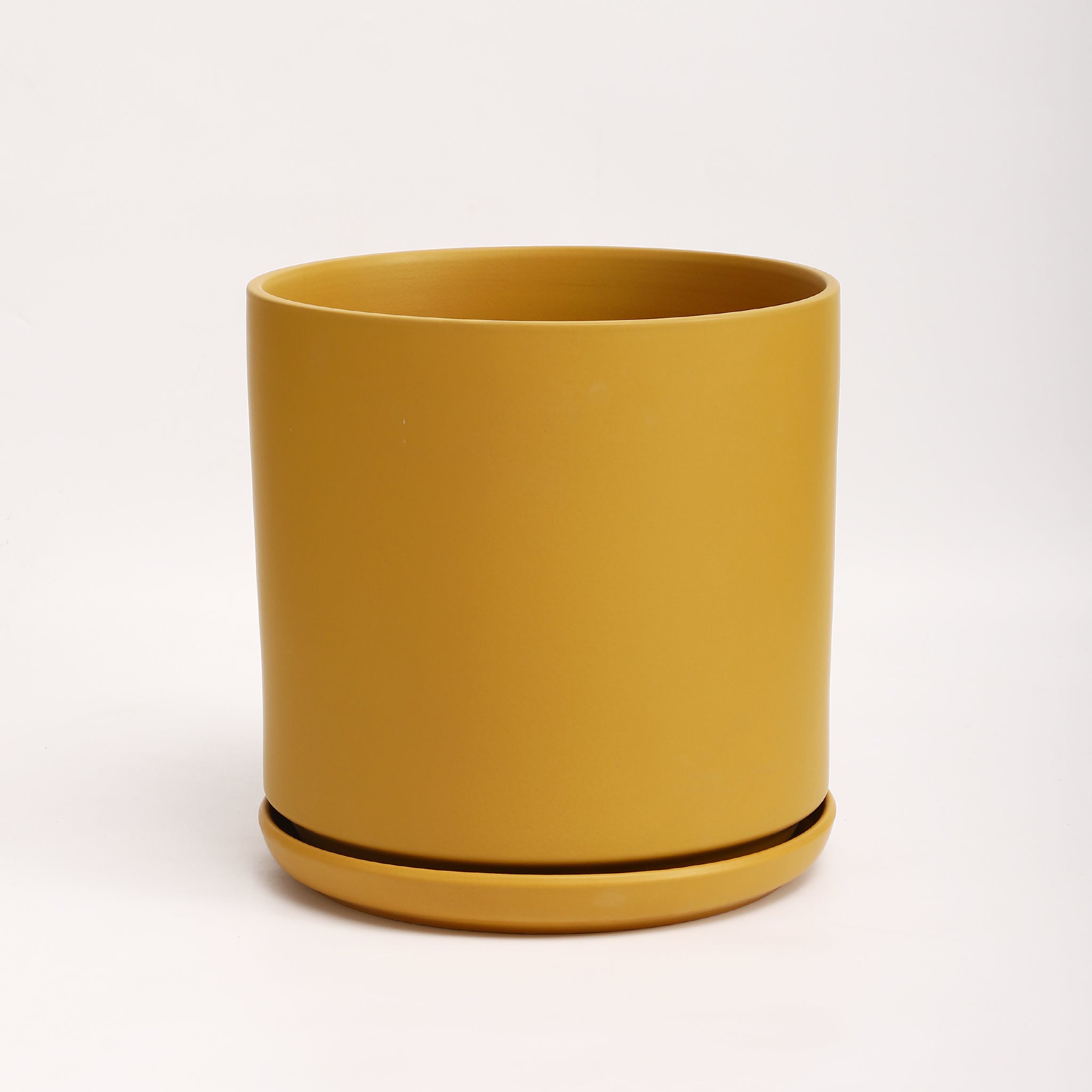
Three glazes, one warm family
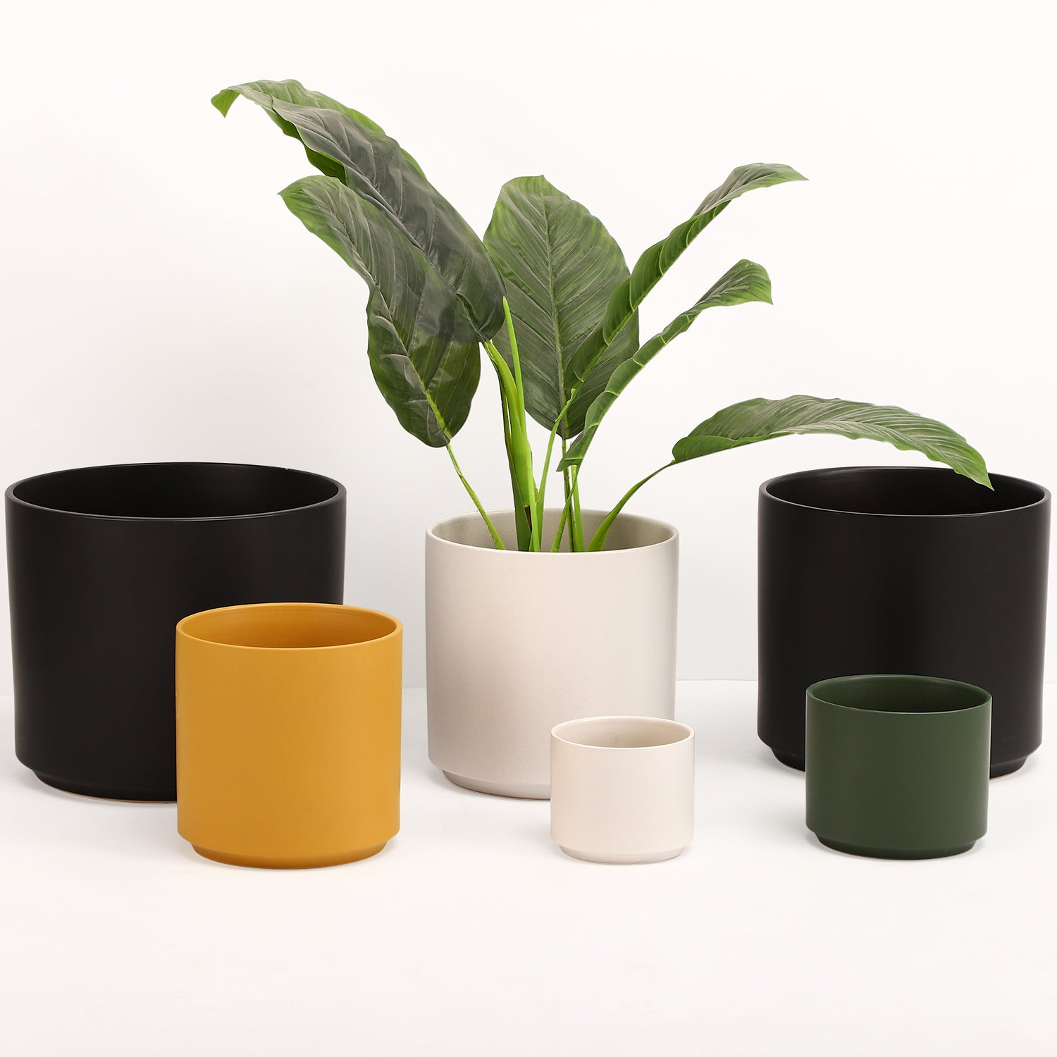
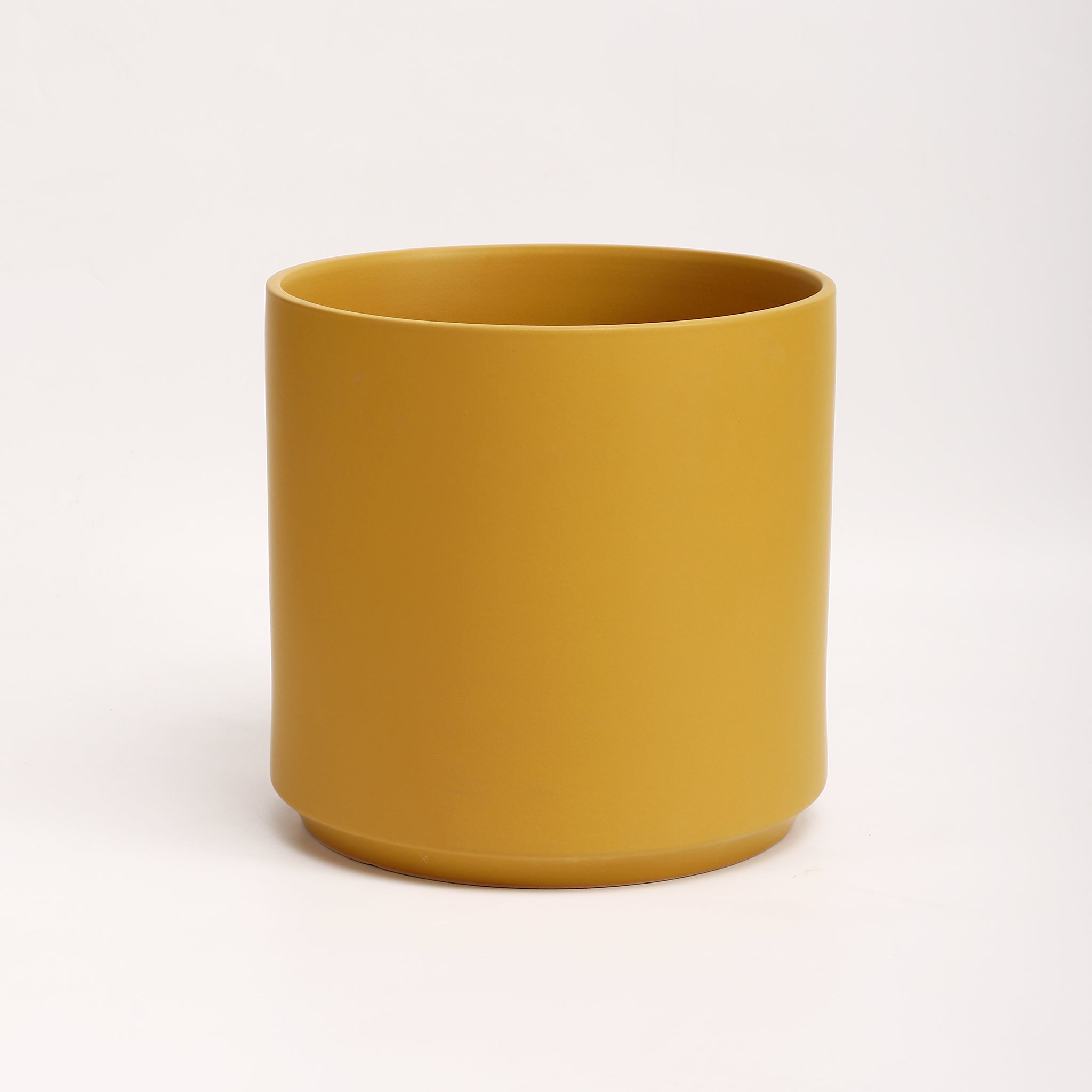
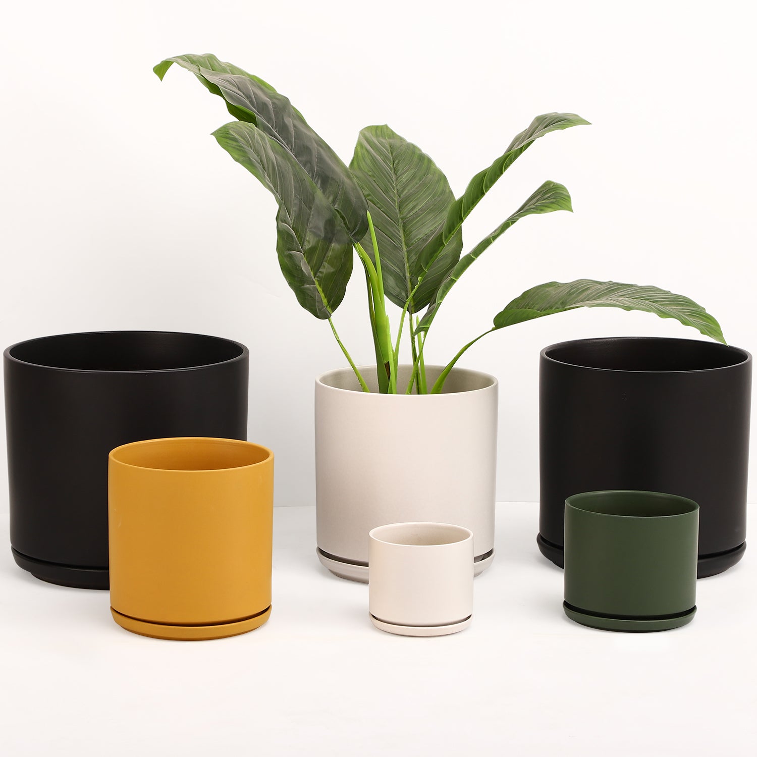
This is the thinking behind our Sunwashed Sands collection. Three glazes—Sand, Oat, and Cream Speckle—each drawn from the same warm family but distinct in character. Sand is the anchor: grounded, matte, the color of dry riverbed clay. Oat runs slightly warmer, almost golden when afternoon light hits it. Cream Speckle is the textural one, a pale base flecked with dark iron spots that only reveal themselves up close. Put them side by side and they read as one family. Separate them across a room and each holds its own. That is exactly how the best designers are working with warm neutrals right now.

The art of tonal layering
The trend is not about matching. It is about tone. Designers this year are layering multiple shades within the same color family—sage on sage, clay on clay, sand on sand—to build warmth without visual clutter. Jennifer McCloskey of All About The Wow calls it “sophisticated layering” in her Real Simple interview. Designer Dominique Bonet of LD&D describes the approach as “warm minimalism, where neutral palettes are softened through texture and materiality.” We designed these glazes with that principle in mind. A Sand Rancho next to an Oat Round Two next to a Cream Speckle trinket dish. Same family. Different textures. Different scales.
How to style sunwashed tones at home
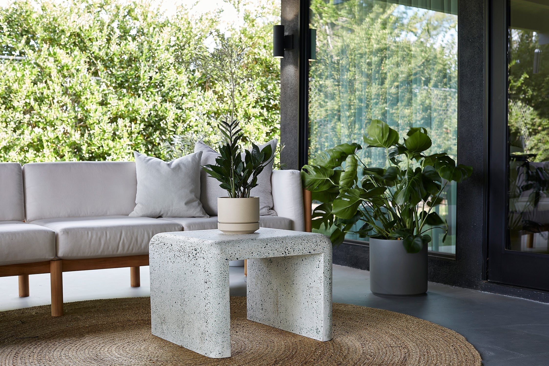
Group in odd numbers. Three vessels on a mantel reads intentional. A single planter on a nightstand reads deliberate. Five pieces across a windowsill, alternating planted and empty, feels collected over time rather than bought all at once. The asymmetry is what keeps things from looking staged. And when the glazes are tonal rather than matching, the grouping feels found—not forced.
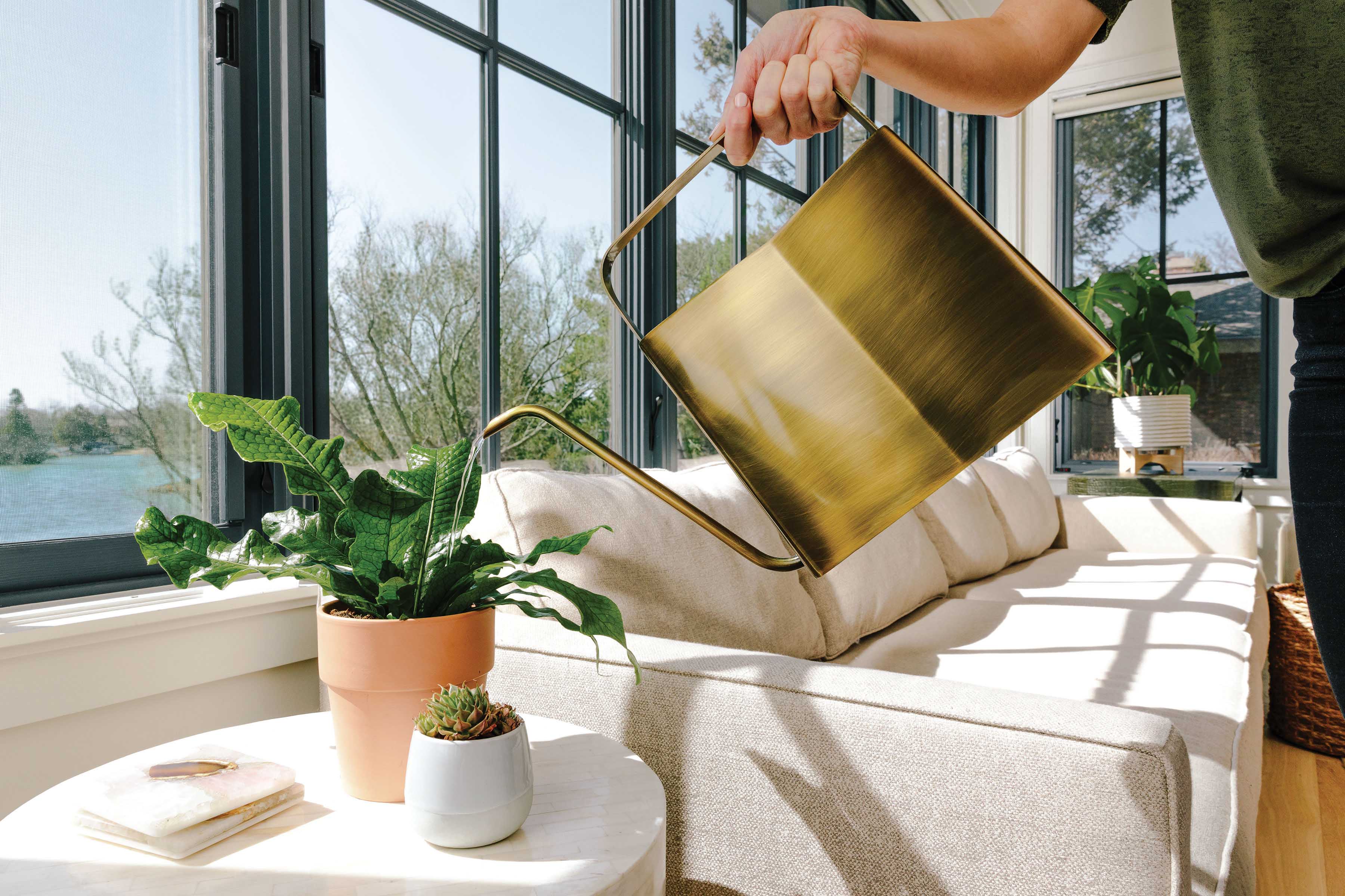
Pair with natural materials. Reclaimed wood, linen, woven baskets, matte stone, warm brass instead of chrome. The 2026 consensus—from Houzz to Elle Decor—is that rooms grounded in natural materials and handmade objects will define the year. Handcrafted ceramics in warm earth tones belong in that context. They age well. They develop character. They are the kind of objects you keep, not the kind you replace when the next trend arrives.


Let the small moments count. A four-inch planter on a bathroom counter beside a soap and a sprig of green. A trinket dish holding a necklace. A Cylinder on a nightstand next to a book you are actually reading. These are not filler. They are the details that make a room feel considered rather than decorated.

The shift to sunwashed tones is not a trend that will burn out next season. It is a correction—a return to the colors that have always felt right in homes, in ceramics, in the places where light falls on handmade surfaces. Sand, Oat, Cream Speckle. They were not designed to chase a moment. They were designed to outlast one. We made these pieces for rooms like that. Quiet ones. Warm ones. The kind you actually want to be in.
Shop the full Sunwashed Sands collection—Sand, Oat, and Cream Speckle glazes across every shape we make.
Shop Sunwashed SandsSunwashed Sands on Pinterest


